For the images is essential to take in consideration that our .bg-color is light
so the pattern that we must use is the following. This should resize any image in the
library according the screen.
Basic structure
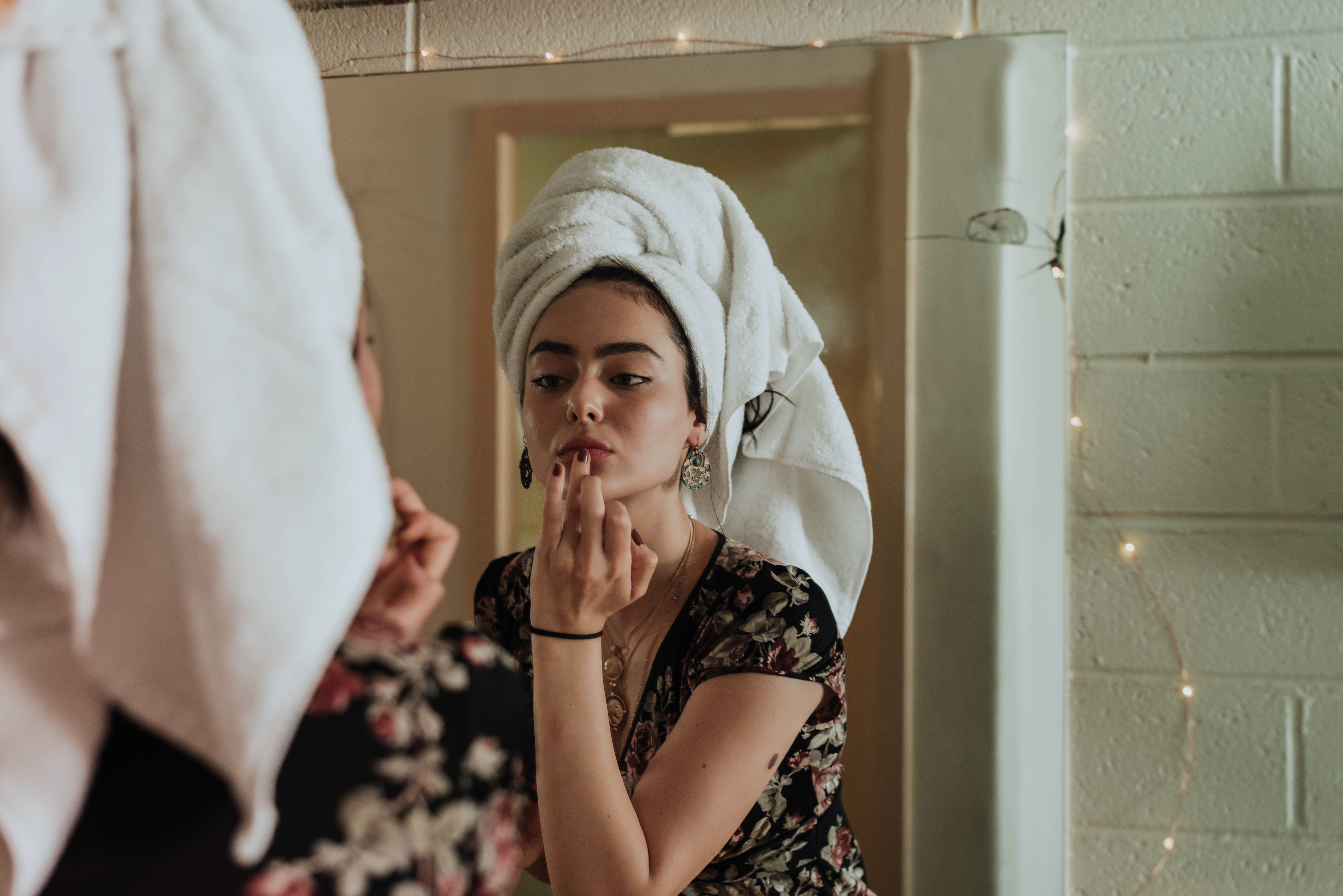
The aspect ratio is a proportional relationship between an image's width and height.
Essentially, it describes an image's shape.
Aspect ratios are written as a formula of width to height, like this: 3:2 for
smaller screen and for large screens 16:9.
Aspect ratio 16:9 for max-width 1024pxAspect ratio 3:2 for min-width 768px
HTML
CSS
Group of images
For responsive group of images its necessary to use the following classes to ensure the same ratio
as well, to display accordingly in different screens.
BEYOND Skincare
BEYOND Skincare
BEYOND Skincare
BEYOND Skincare
HTML
CSS
Thumbnails
This is a smaller version of an image.
When we hover on a thumbnail image, it displays social icons and a text banner. As well, when you click
on the social icon, is redirected to the social site.