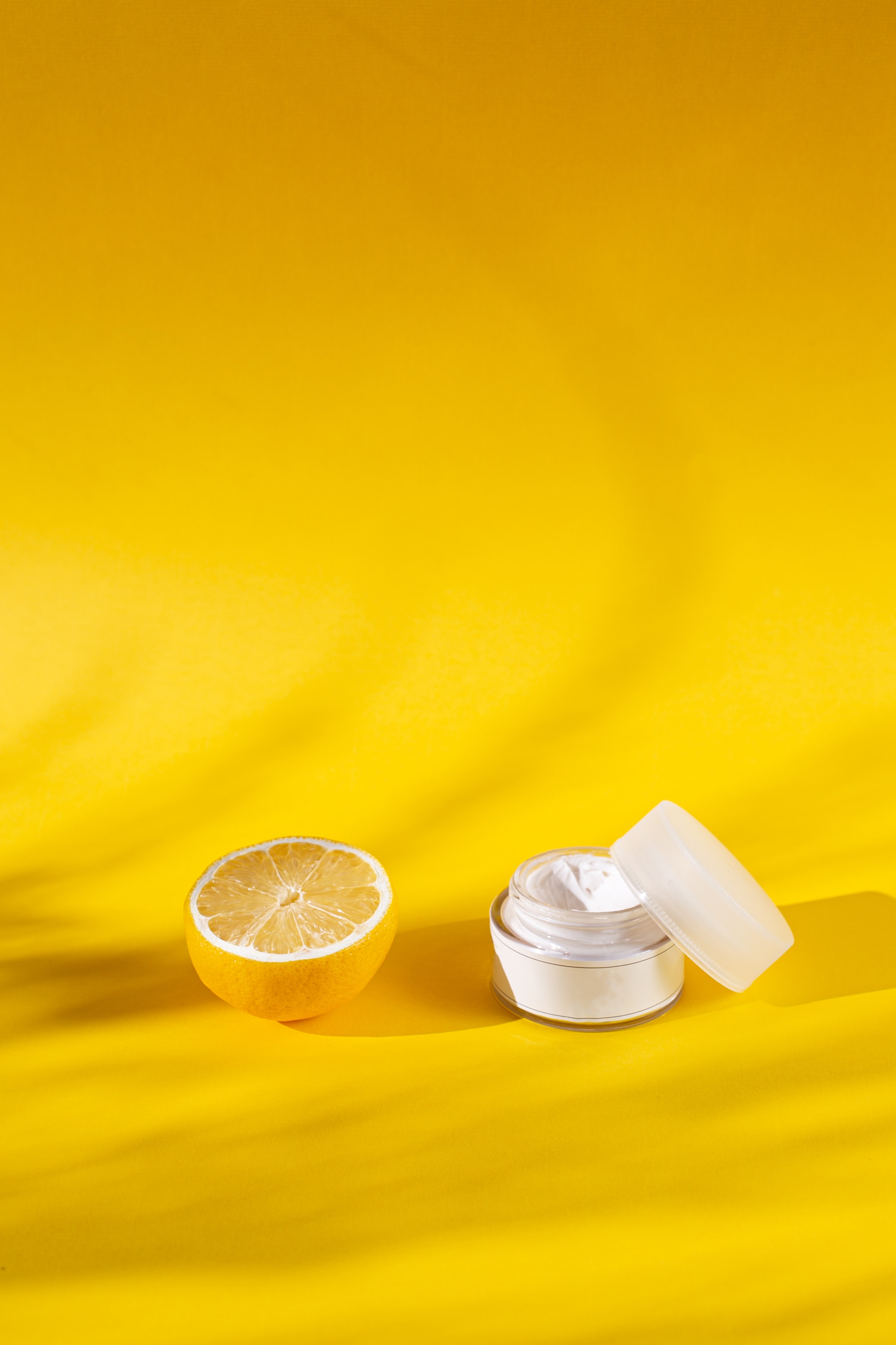
Name of product
$$
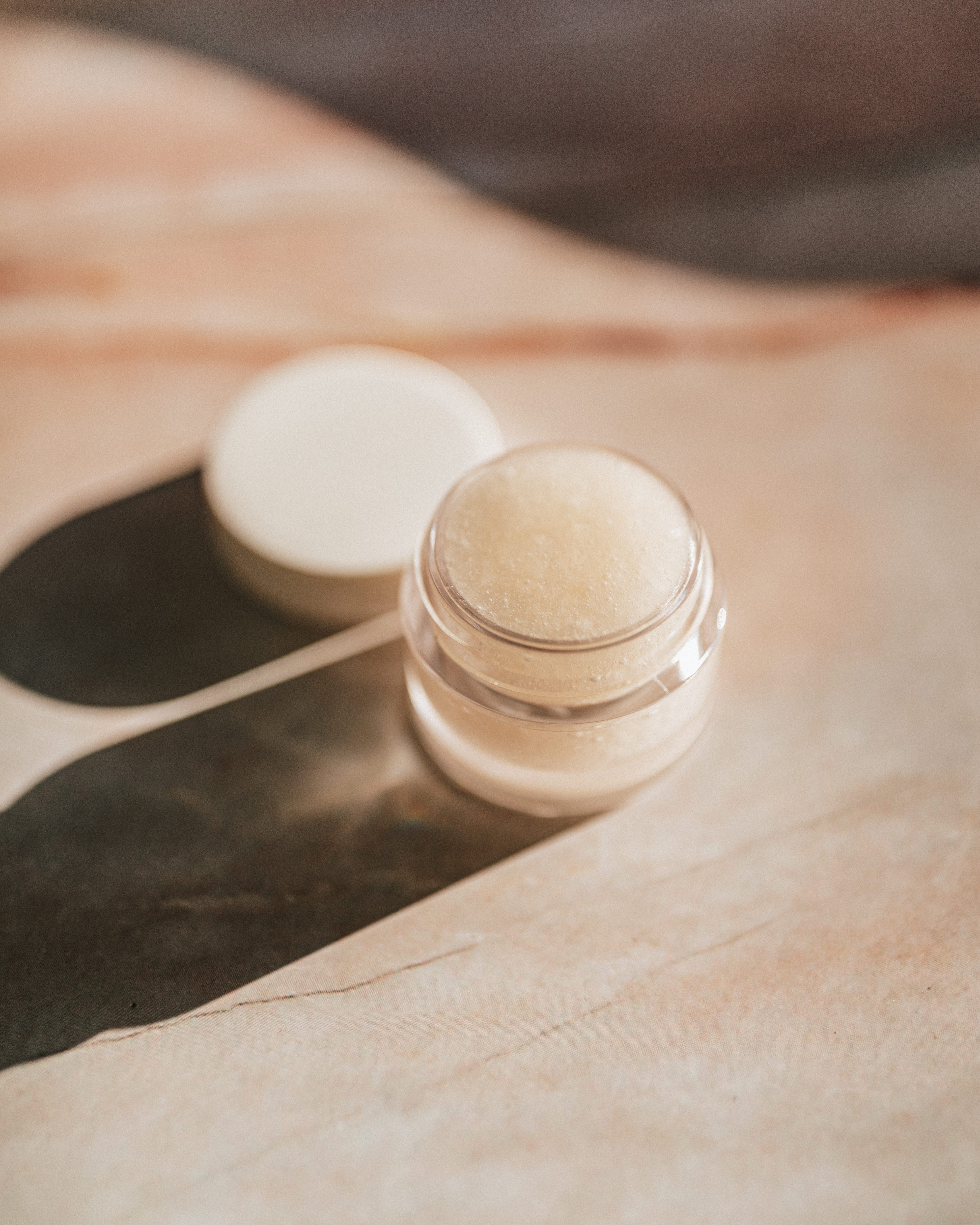
Name of product
$$
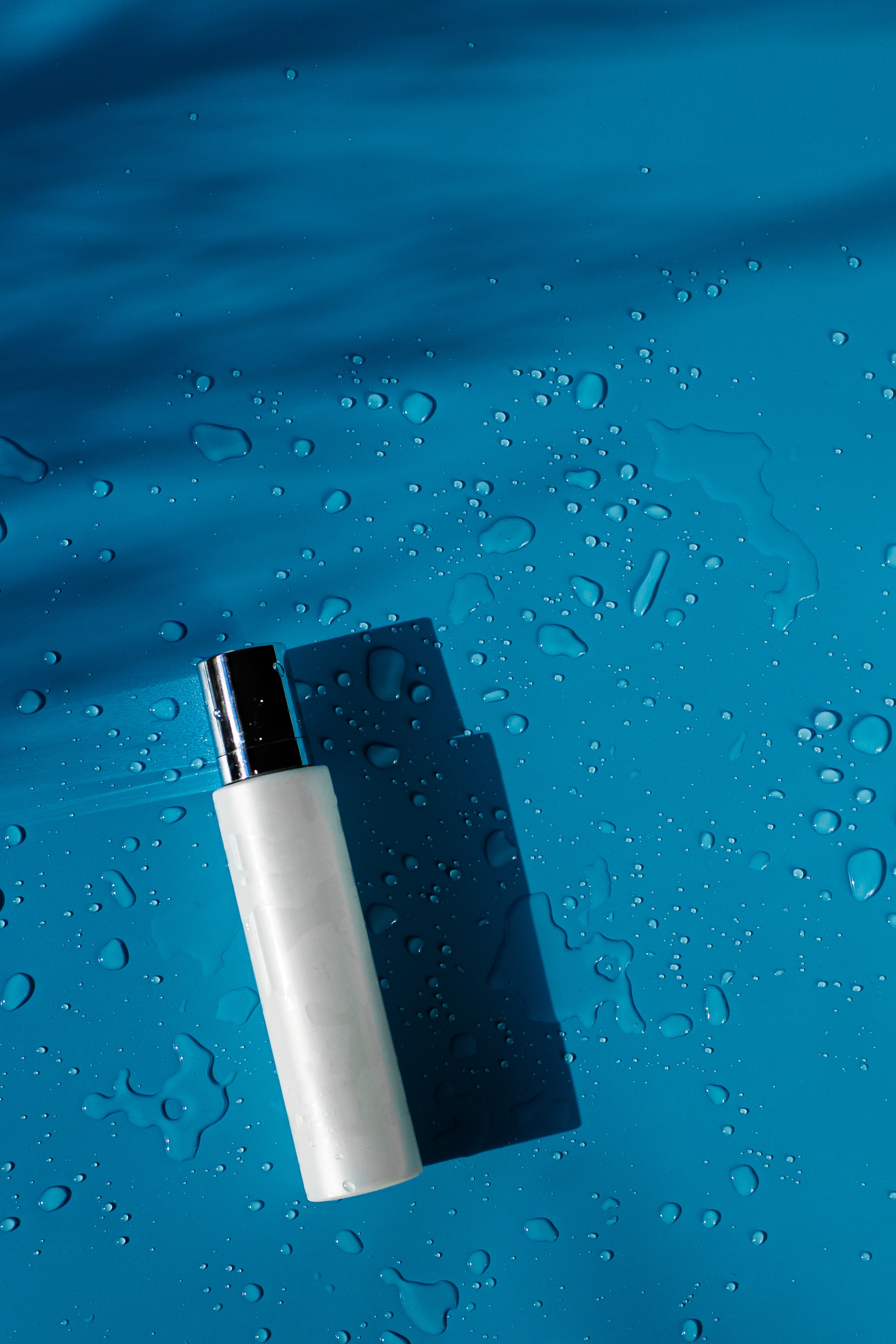
Name of product
$$
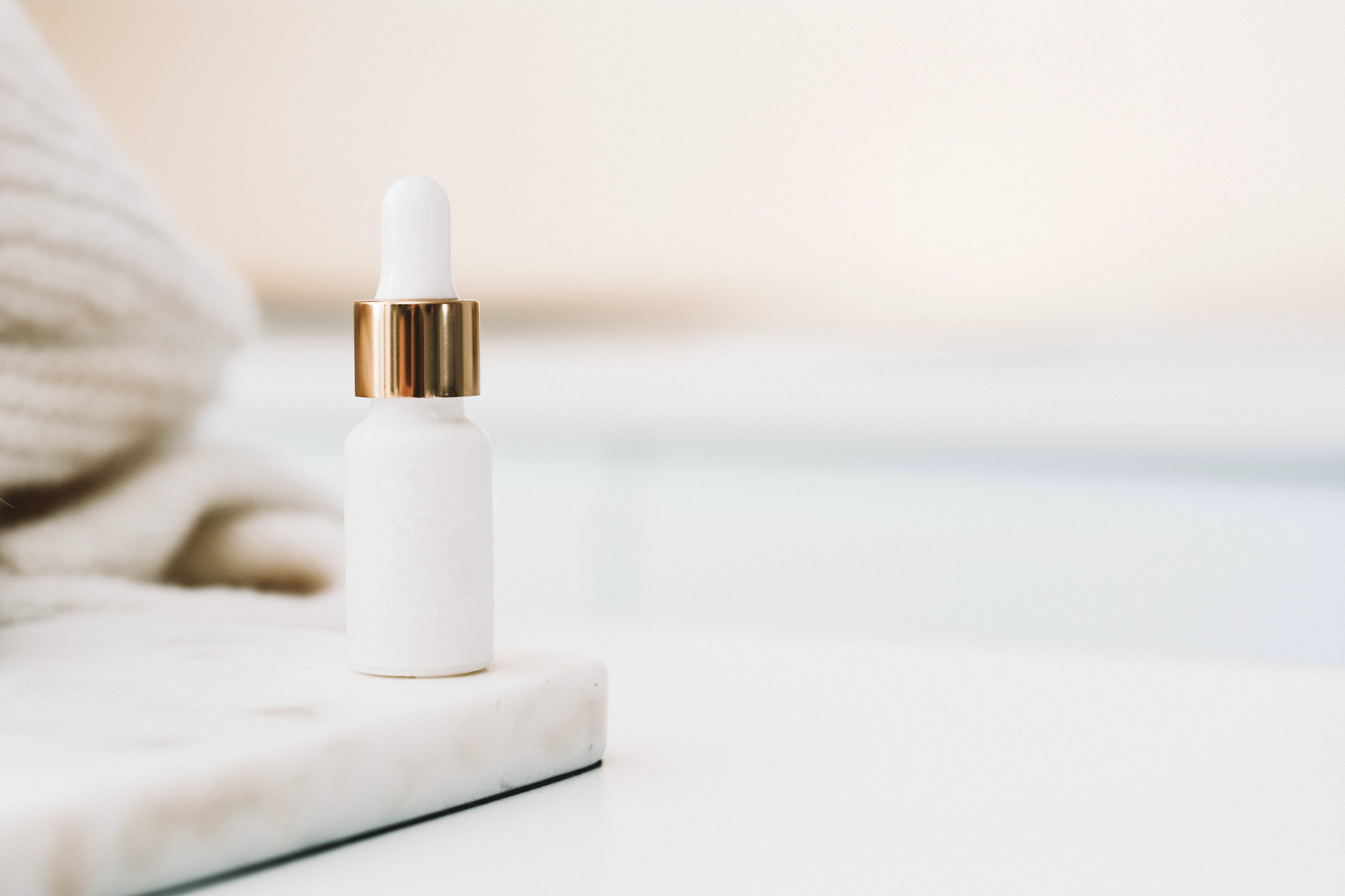
Name of product
$$
Name of product
$$
This elements are created individually that will be use to build and structure the user interface with focus, clarity, usability and accessibility.
Each components has a clear purpose and behavior where they were designed to work together to form a cohesive user experience as well, considering the different needs when interacting with the website.

Lorem ipsum dolor sit, amet consectetur adipisicing elit. Aspernatur totam, enim dolor nobis debitis facere animi, itaque est temporibus dolorem minima magnam doloribus sit!
Lorem ipsum dolor sit, amet consectetur adipisicing elit. Lorem ipsum dolor sit, amet consectetur adipisicing elit.


This is a second version of a carousel where we display products and allows you to display multiple products or images in a single container element to showcase featured products or product categories.
For displaying purposes in the design system the container main#carousel is justify: flex-start but in the example is set as center to follow the guidelines.
Name of product
$$
Name of product
$$
Name of product
$$
Name of product
$$
Name of product
$$
| Name | Age | |
|---|---|---|
| Jane Doe | 25 | jane@example.com |
| John Smith | 30 | john@example.com |
In this example, the <footer> tag is used to wrap the footer content, and CSS class .footer-basic is used to style the footer's background color, padding, and alignment. The <ul> tag is used to hold the footer content, and CSS is used to set its margin to 0 to remove extra space.